


Email Pop-Ups That Aren’t Annoying
27 January, 2025
27 January, 2025
Straight up, email pop-ups are one of the most effective tools for capturing email subscribers. Websites with well-designed pop-ups see an average of 4.01% in conversion rates, compared to around 2% for those without. And, through fine-tuning the targeting strategy, such as adding opt-out, lead magnets, form fields, images, etc., conversion rates can be significantly improved. So pile it all on, right?
Wrong.
There’s a fine line between engaging and annoying.
At Coura, we know the best email pop-up feels like a helpful nudge, not a disruptive roadblock. So here’s how to strike that balance and create pop-ups that convert without alienating your audience.
When it comes to pop-ups, timing can make or break your user experience. Trigger your pop-ups strategically to maximize engagement:
Pro tip: Avoid showing pop-ups immediately upon page load. If they’re a new customer, how would they know if there’s any interest if they haven’t seen anything? It should come as no surprise, research shows that pop-ups triggered after 5 seconds convert 2x better than those that appear immediately.
People are more likely to engage with your pop-up if they feel they’re getting something worthwhile in return. Consider these tried-and-true incentives:
Make it clear what they’ll gain from signing up, and don’t forget to deliver on your promises. According to OptiMonk, 80% of users are more likely to engage with a pop-up when it offers a clear benefit like a discount or freebie.
With the majority of web traffic coming from mobile devices, your pop-ups need to be designed with smaller screens in mind. Keep these best practices in mind:
Surprise surprise, a bad mobile experience can lead to frustration and quick exits.
Even the smallest tweaks can have a big impact on your pop-up’s performance. A/B testing is key to finding what resonates with your audience:
Data doesn’t lie. Use analytics to guide your design decisions and continuously optimize your pop-ups for better results. Businesses that A/B test their pop-ups can see conversion rate improvements of 20% or more.
The best pop-ups feel like an extension of your brand. Keep the tone friendly and conversational while avoiding excessive text or clutter. A visually appealing, well-crafted pop-up can leave a lasting positive impression.
Maybe this isn’t everyone’s aesthetic cup of tea, but Everlane’s pop-up is simple, direct, and clean. There’s no confusion about what they’re offering, or how to get it.

Glossier is a beloved brand that expertly leverages insider access to get potential customers to sign up.

There’s a lot happening, but Olipop makes the list because they demonstrate the value in their sign-up by utilizing social proof to encourage customers to think, “Should I sign up for this too?”

The placement of Fort’s mobile pop-up is as perfect as it is enticing. It stays with the customer so they can check things out before snagging a massive discount.

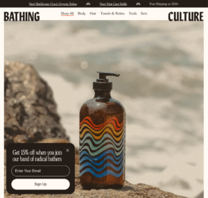
Bathing Culture makes a smart move on their desktop website by keeping product shots in view. Clicking out of the pop-up to see what’s going on isn’t necessary, so the likelihood of the pop-up being viewed as helpful is significantly higher.
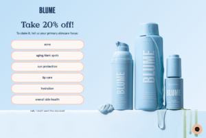
Blume does a great job of connecting the dots between saving money and fixing a problem. Between that and gorgeous, chic branding, we can all but promise they’re converting left and right.
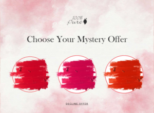
A clear brand identity and a mystery discount? Say less. We’re clicking through and signing up.
Creating email pop-ups that aren’t annoying is all about balance. With smart timing, valuable incentives, mobile-friendly design, and a commitment to testing, you can engage your audience and grow your email list without driving visitors away.
Need help perfecting your email pop-ups? At Coura, we’re experts at designing seamless, conversion-optimized experiences that your users will love.
Contact us today if you’re ready to make your Shopify storefront work harder for you.